report building wizard
Role: Sr UX Designer • Company: Aha! • Teams: UX/PM/Engineering

The problem
The current experience for building a report is difficult to use and is the source of many support tickets. Many of our customers never create the reports they need and therefore never see the value these reports can provide. Reporting is one of Aha! most powerful features - by making the creation experience simpler we can help bring more value to Aha! in general.
Goals
Make it easier for customers to build the report they need to help them communicate the data to stakeholders.
Improve the experience of adding and organizing data, and adding filters for the following report types:
List
Pivot
Chart
Custom roadmap
Scope
There are many things we could do to simplify report building, so we must be careful to manage scope for this feature to make the highest impact changes first. This feature will be focused on:
Finding the correct report/roadmap you need quickly
Improving the steps for building a new report
Making example reports more visible while creating report
Research & Analyze
Talking directly with our customers is my favorite way to get a better understanding of their pain-points and needs. Additionally, hearing from users in their own words helps avoid guesswork and eliminate assumptions. For this project we interviewed around 4 Aha! users that used reports frequently. We also analyzed feedback around creating/editing reports from our Ideas Portal - we have over 703 ideas just around reporting alone!
User pain points
From speaking with our customers, and our internal customer service team, we where able to outline the following pain points we wanted to solve:
Customers know the type of report they want to create (list, chart, pivot, etc) but don’t know how to get started
Customers know the data they want to show, but don’t know which type of report is best for that data
New customers want to start with an example report, but don’t know where to find them
Current ‘create report’ UX makes the user open 4 different modals to create one report

Ideate & Design
I started with a competitive analysis to see how other application solved this problem to evaluate industry standards. This allowed me to understand what works and what doesn’t from a user's perspective. It is also beneficial to find any common usability patterns that might already exist around the ‘create report’ experience that our user’s are familiar with.
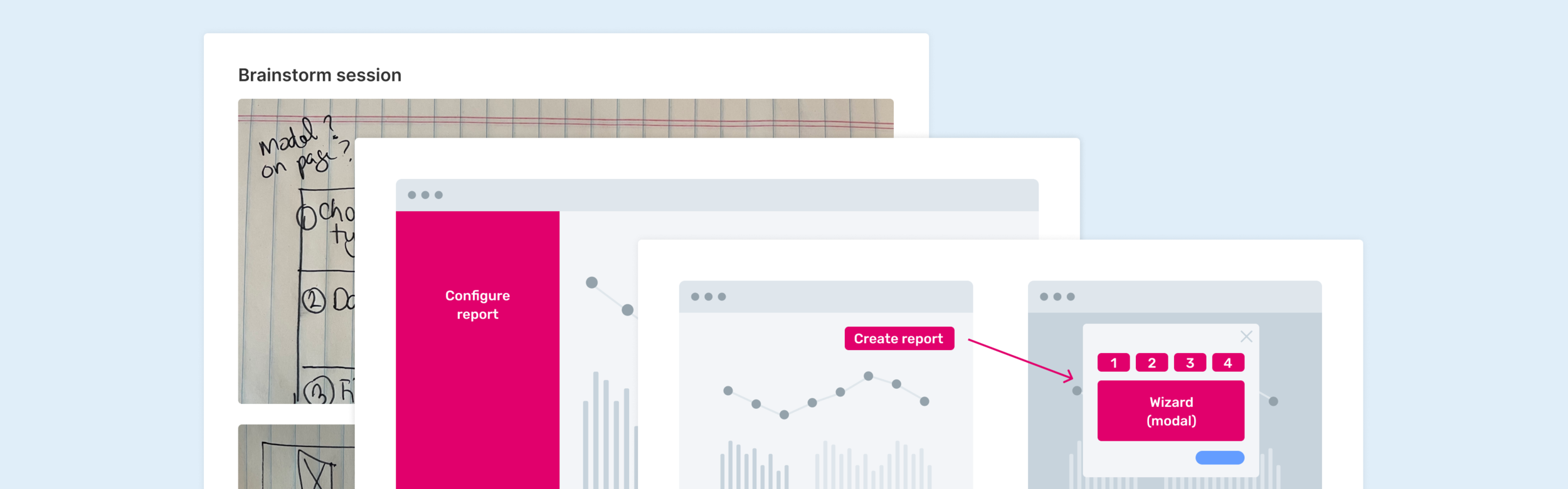
Lo-fi WIREFRAMES
Once I started wireframing I was able to use those to quickly brainstorm with my PM and developer. We landed on two possible paths:
Create a new stand-alone report configuration page (like Salesforce) or
Create a report builder wizard that guides the user through steps
We decided to move forward with the report builder wizard as it would allow us to guide the user, which would be especially helpful for our trial customers. Another benefit of the modal is that we could open it from various parts of the application. When we showed these options to engineering the feedback was that the wizard would be much quicker to build and load then a new configuration page.
Hi-fi mocks and prototype
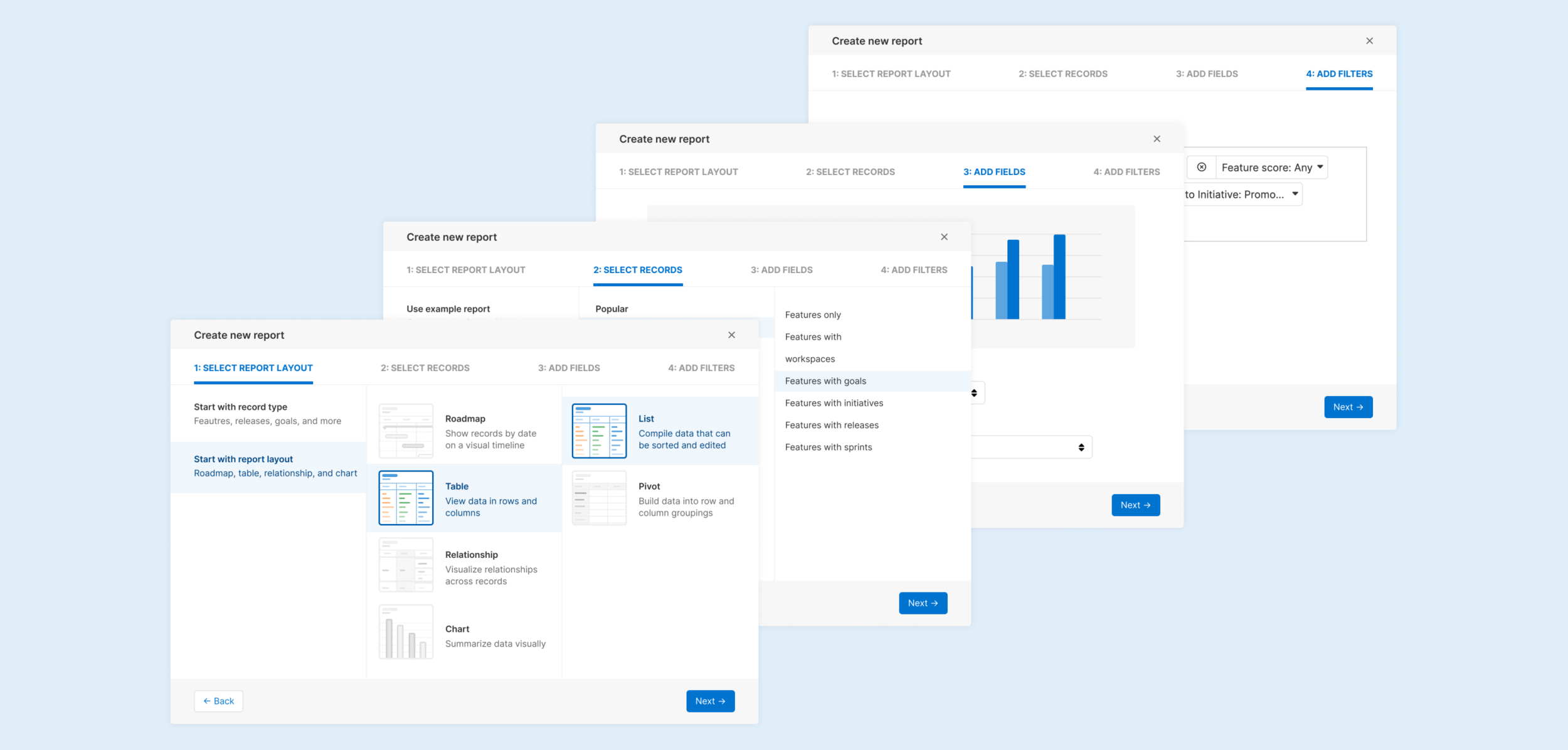
Once we felt comfortable with the direction of our proposed solution, I could start working on the more detailed designs. Building a clickable prototype at this point in the process helps me create a more natural experience of the flow and highlights anything we may have forgotten. Having a working prototype allowed me to:
Continually show designs to the PM/UX/Engineering team to receive feedback
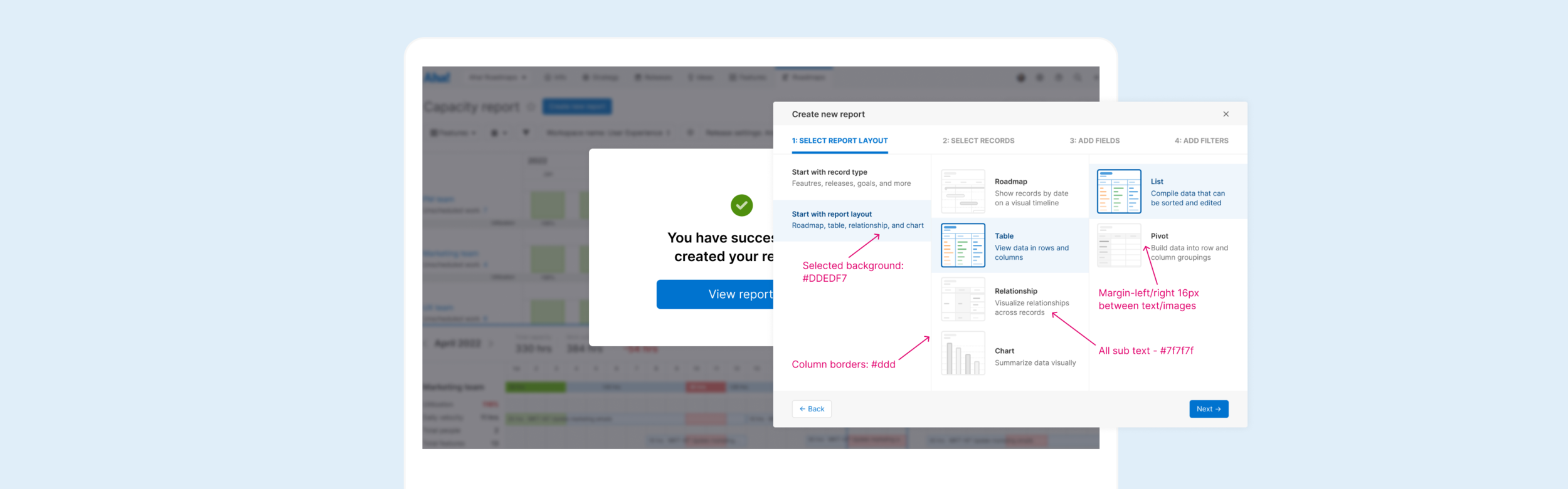
Finalize details for each step of the report builder (choose report type, select records, add fields, add filters)
Guarantee the UX worked for all of our different report types - we wanted a seamless experience for the user no matter which report they were building
Validate & Iterate
Now that we had a working prototype we were able to get feedback before releasing this to our customers to make sure the design was intuitive and solved the pain points we found from our initial research.
User Testing
We tested the prototype on 5 people and found:
Too much text, and would like to see example reports on the first step
Some of the terminology was still confusing
Power users might get slowed down if we force them through all the steps
Design Iterations
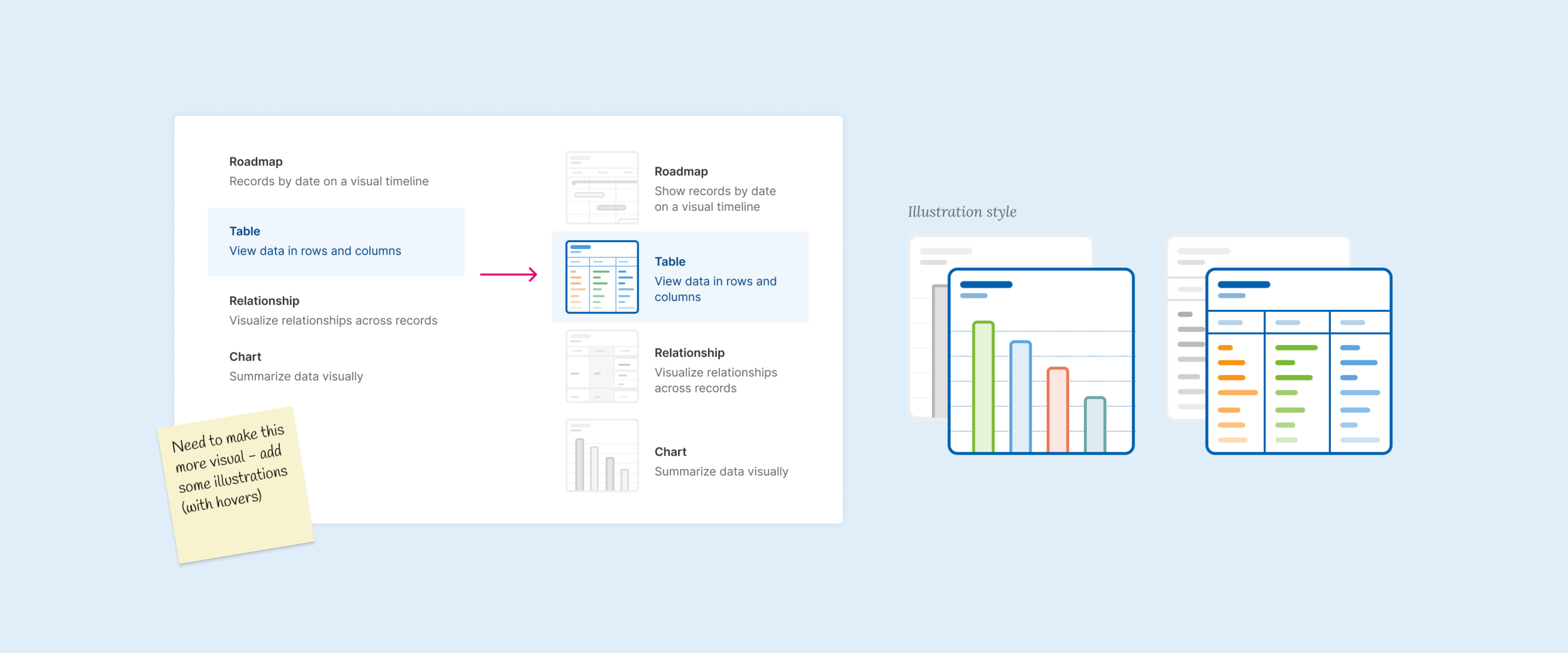
As clear as I thought my initial designs were, it turns out that people were still struggling with some of the steps in the wizard. I also knew I wanted to incorporate more visual aspects to the flow - so we discussed using screenshots from the app or creating abstract illustrations. We ended up choosing illustrations since they wouldn’t have to be updated every time we updated the UI. The illustrations also gave the report builder a fresh new look that brought in a more ‘fun’ feeling around creating reports. We iterated on some copy updates so we could standardize and simplify across all four steps.
Development
Once we felt comfortable with the UX we were ready to work with engineering to build the feature. Before our kick-off meeting with engineering I worked with my Product Manager to breakdown the requirements and add any edge case designs (error states, empty states, hovers, animation).
Engineering handoff
We always start every project with a kickoff meeting with Engineering, myself, and the Product Manager to make sure everyone is on the same page and there are no blockers. Since we are a remote team we will usually set up a slack channel between all teams to make sure everyone is readily available if there are any questions.
QA review
Once engineering pushed their first draft to stage I was able to start the QA process. I like to mock up any design updates needed verses typing it out as this can be much easier to understand. I added requirements to the feature outlining where the execution didn’t align with the initial design.
Retrospective
Overall I love how this project went, getting information about our technical limitations up front allowed us to narrow down some of our solutions without getting too far with the designs.
What went well
Great communication across teams allowed us to be able to make updates quickly when new requirements came in later in the project. Our iterative approach to building and testing performance allowed us to make small and quick adjustments while receiving feedback. Another great aspect of this feature was our exploration around illustration styles that we have since incorporated throughout the app.
Lessons learned
We had to push our go-to-market date out a few weeks due to the size of the project. We could have potentially found ways to deliver value more incrementally along the way in order to incorporate more feedback into our final product.