Client: Hardware Store
Project: Mobile Cart UX
Year: 2015
Problem: Our client was finding a lot of users where abandoning their carts on the mobile cart page. We were tasked with identifying the issues and designing solutions that would not only solve existing problems but also add enhancements to help with conversion.
Challenges/Issues
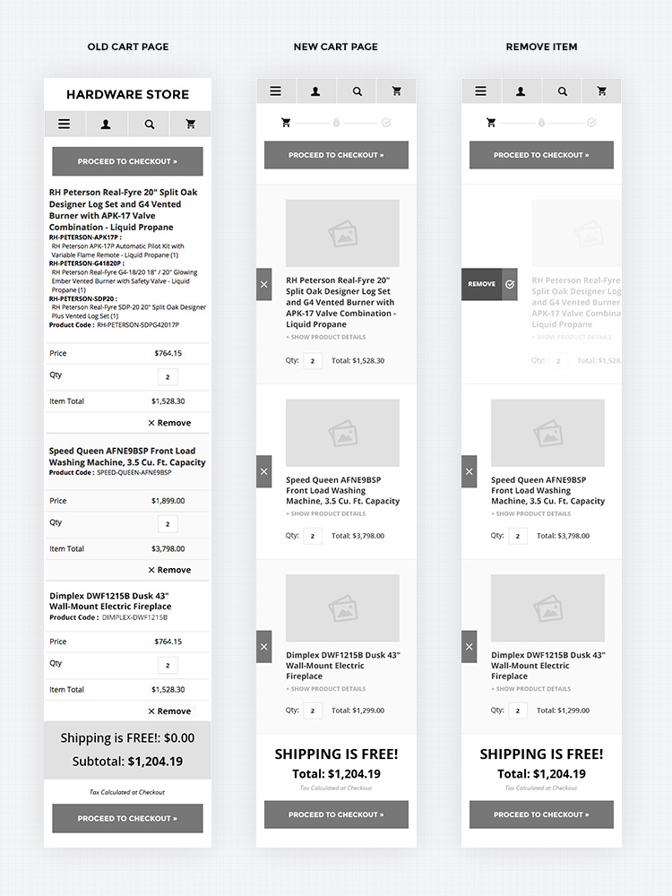
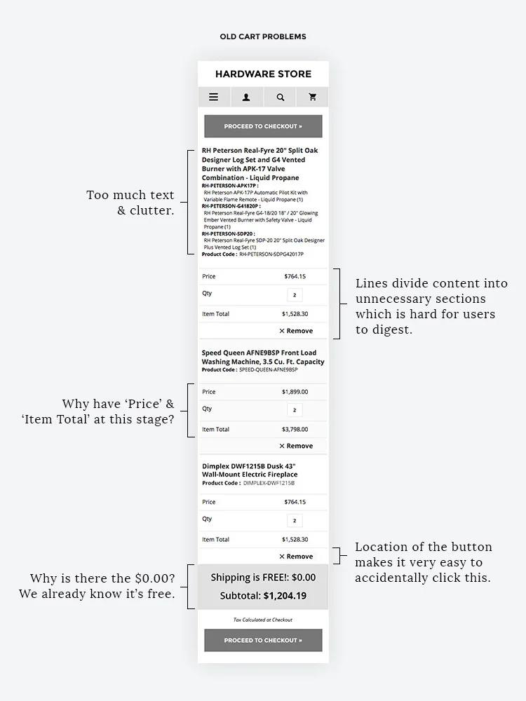
• Too much text & Clutter – The product name and all of the details were listed out on the cart page which was overwhelming for the user and unnecessary at this point in the purchasing process.
• Divider lines - The price, quality, item total and remove button all had divider lines which broke this section into too many parts. With a lot of items in the cart it became hard to tell which information went with which product.
• Price & Item Total – At this point in the shopping process it seems redundant to show the individual price for the product. Item total is the only thing the user would need.
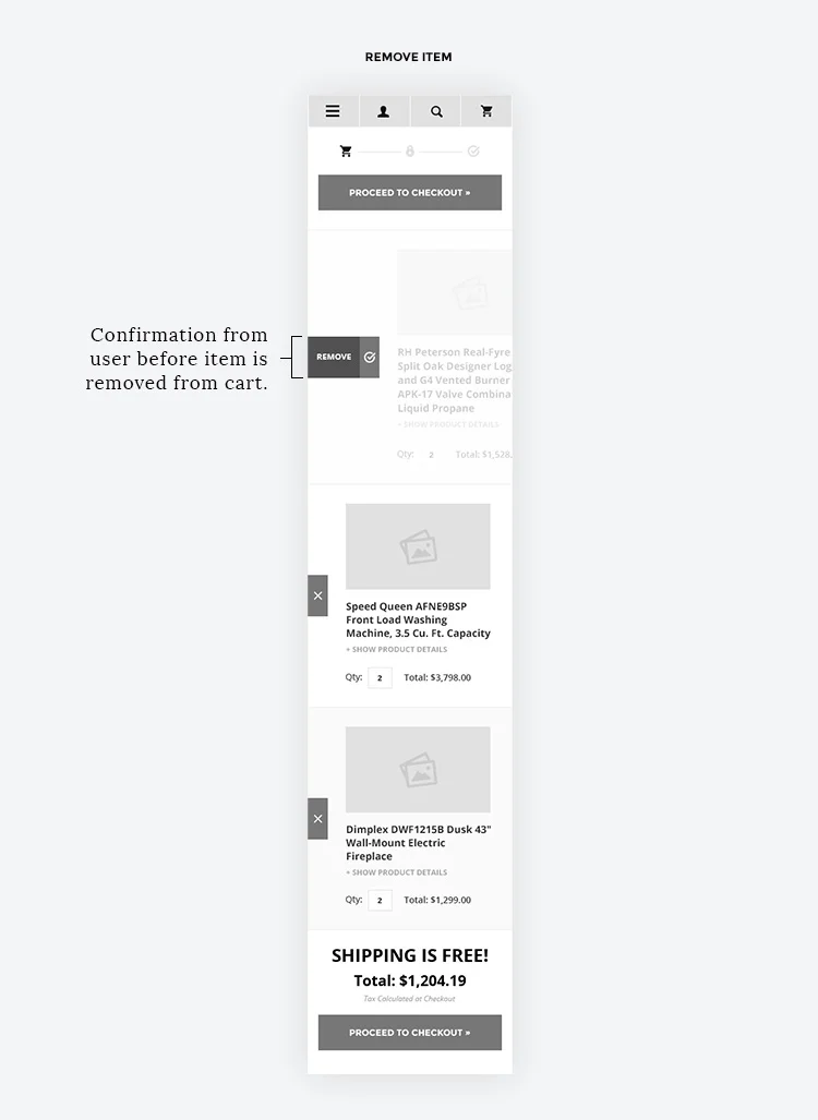
• Remove Button appearance and location – Currently the remove button doesn’t look like a button and it is very close to the right hand side of the screen which is very easy for users to accidentally click. There is also no confirmation via the user once this is clicked. The item is just removed – how frustrating if this was on accident!
• Dollar amount for Free Shipping – Users don’t need to see that shipping is $0.00 since it is free. Removing unnecessary content like this will help streamline the cart page.
Proposed Solutions & Enhancements
• Remove logo/footer from cart page – Simple yet easy way to remove distractions and allow the user to focus at the task at hand.
• Add progress icons so users know exactly where they are at every stage in their shopping experience.
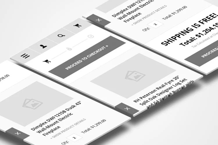
• Add images thumbnail for each product so users can easy see what is in their cart.
• How only the product name – Hide additional details in a clickable expandable section.
• Show only the quantity and total price only – remove distractions and keep cart clean.
• Move the remove item button to the right of the screen where it is not going to be clicked by accident. When it is clicked the product will dim and shift to the right where the user will be able to confirm that they do want to remove this item.
• Remove dividers within product information, use row stripping between items to help divide each product visually.
• Simplify text for free shipping and total amount.
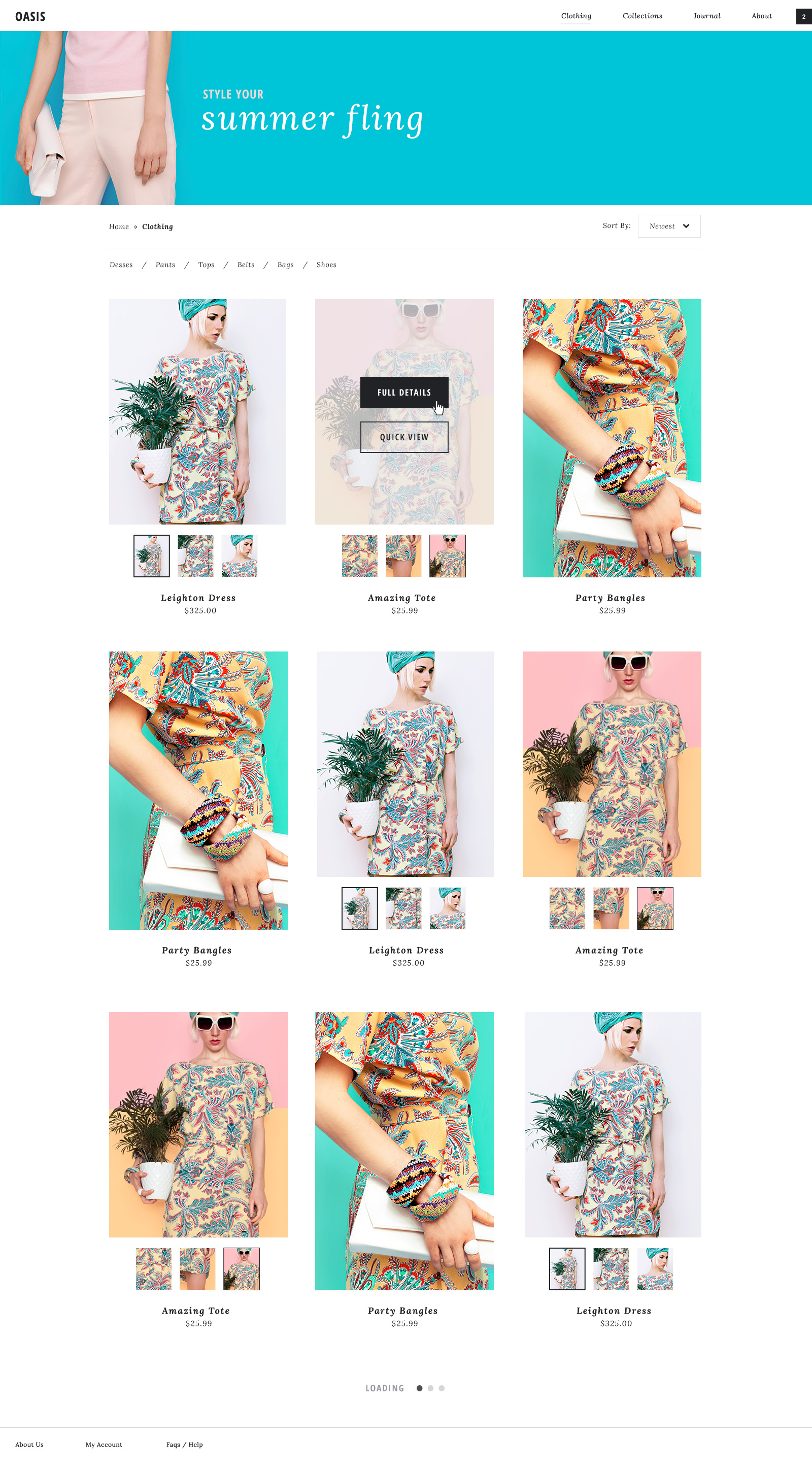
Project: E-Commerce Theme
Year: 2016
Oasis is a theme that was designed to be extremely customizable, easy to use, and fully responsive. The minimal and clean design allows it to be suitable for every type of industry.
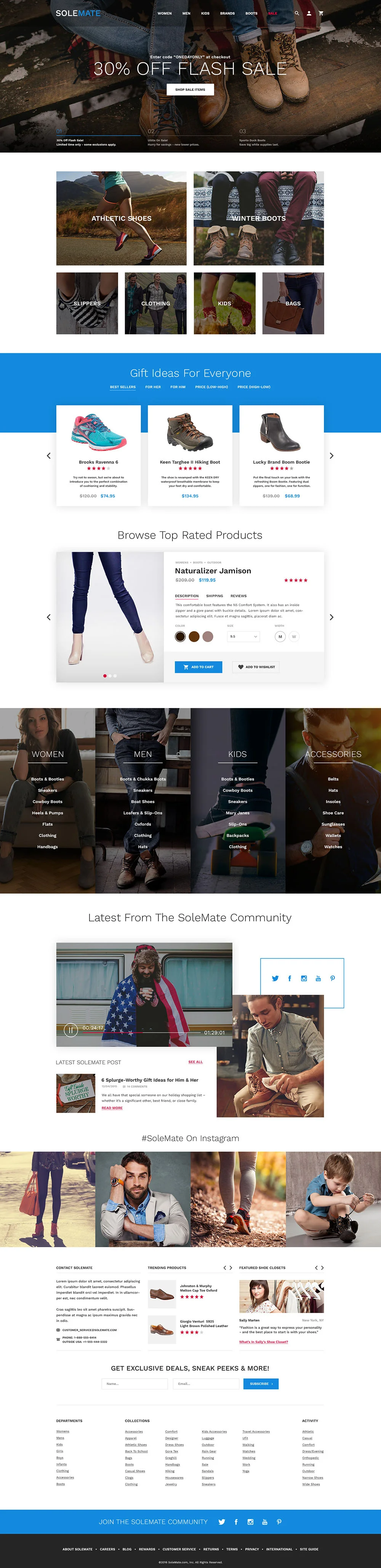
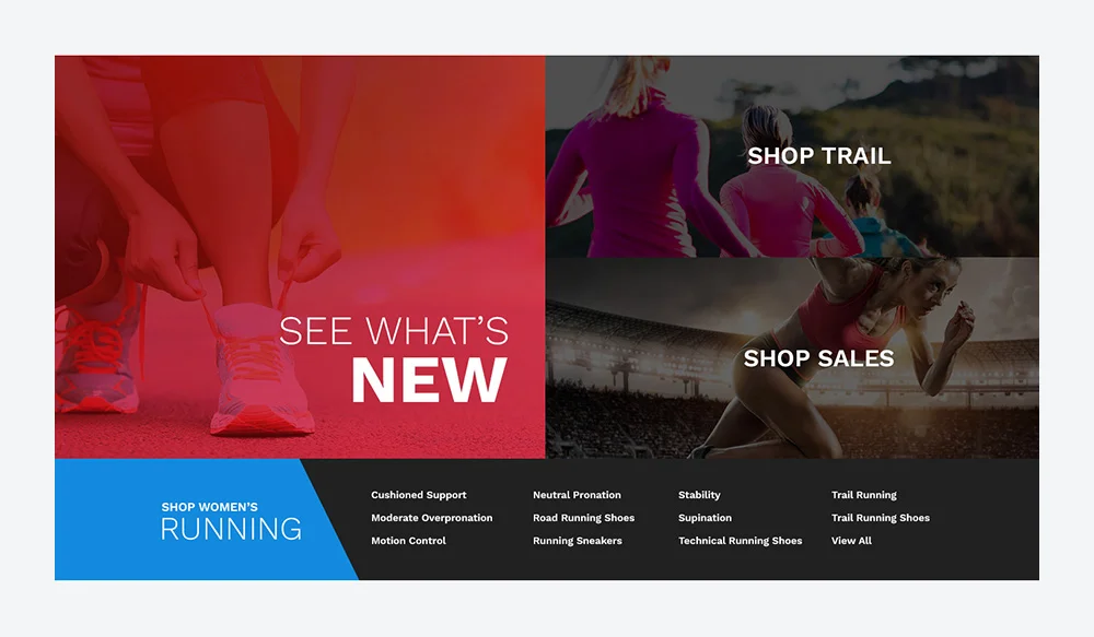
Client: SoleMate
Project: E-Commerce Web Re-Design
Year: 2015
SoleMate requested a fresh new look for their e-commerce store. They hadn't updated their site in many years and it was time for an exciting new look that would reach more users. With this re-design they wanted to target younger users (19-30ys) to try and tap into this market.
With this in mind I used sites like NIke and Adidas as design inspiration since they have a great relationship with this specific target audience. By using great images and modern design esthetics I was able to design for the younger target audience while allowing the older users to still feel comfortable and included.
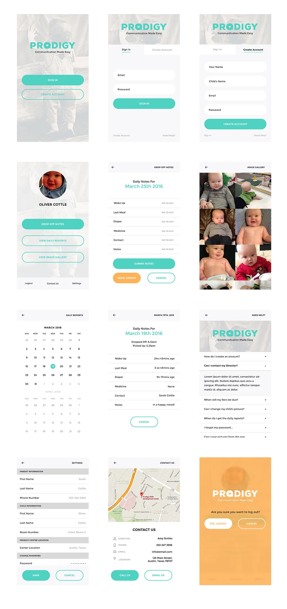
Client: Prodigy
Project: App
Year: 2016
I wanted to make an alternative way for parents and teachers to communicate with eachother about their child's daily care.
Most schools use paper printouts to log what each child did during the school day. Parents will pick up this log at the end of the day, and return it the following day with any updates they would like their teacher to know about.
Printing out paper for every student each day is not only bad for the environment, but so much harder to track for both the parents and the school.
This app will store all the child's information in one place where it can be easily and quickly acessed by all the neccesary people.
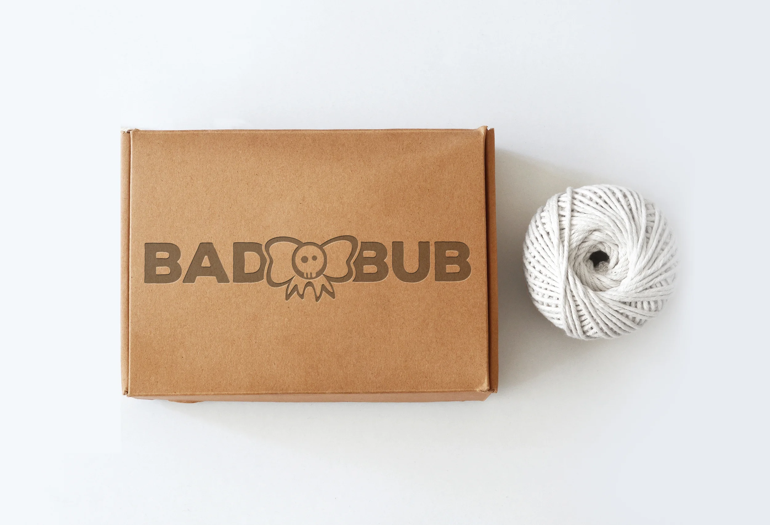
Client: Bad Bub
Project: Visual Identity
Year: 2016
Bad Bub needed a visual identity that would set them apart from other baby accessory companies. Their products are designed for the bad ass babies (and parents) out there who want to be the coolest kid on the block!
The rough edges of the typeface convey a sense of toughness, while maintaining readabilty at all sizes. The logo mark is a hand-drawn hair bow with a skeleton face that was designed to be recognizable as a stand alone element.
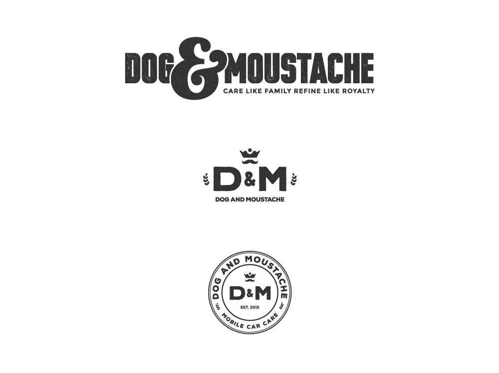
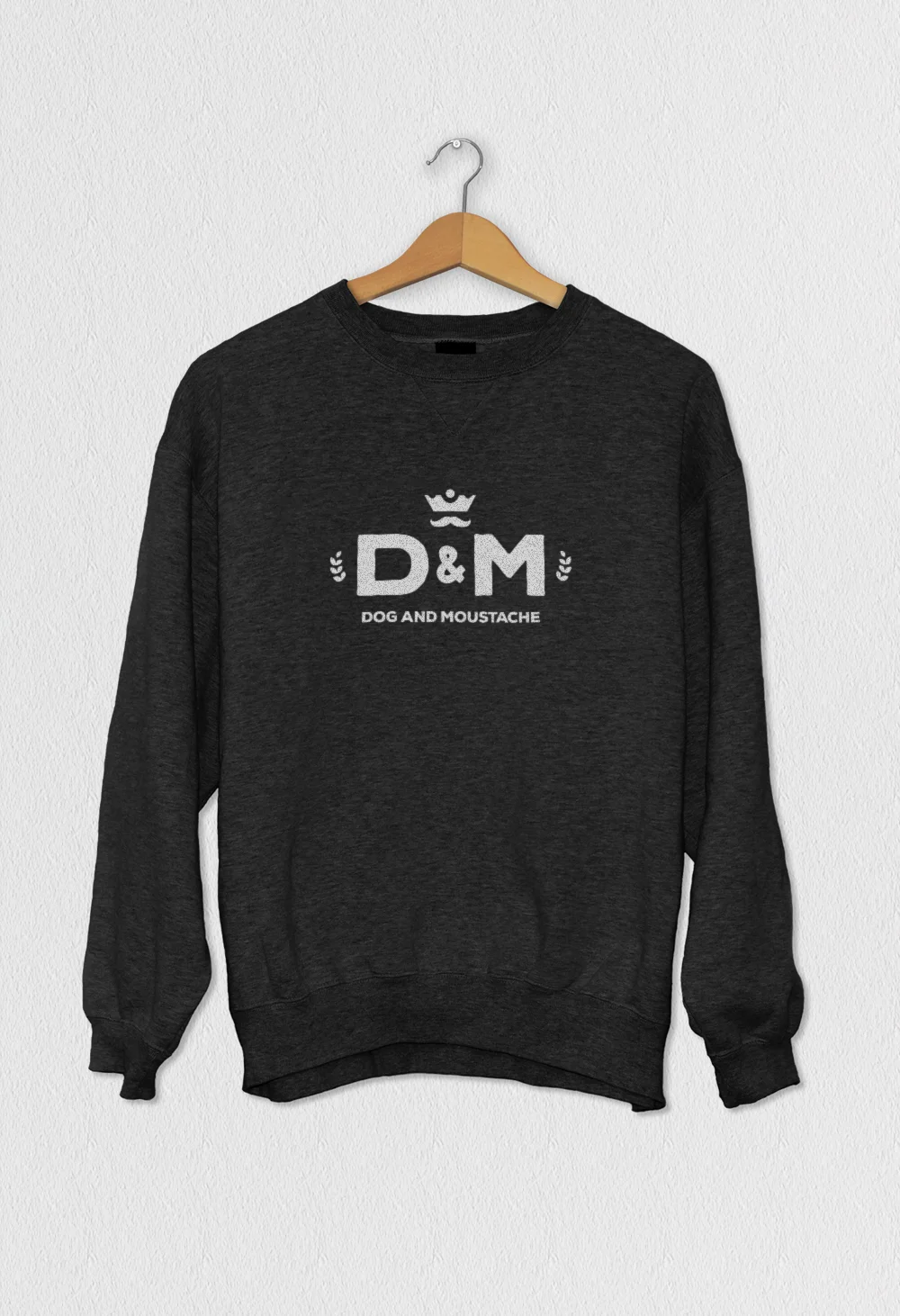
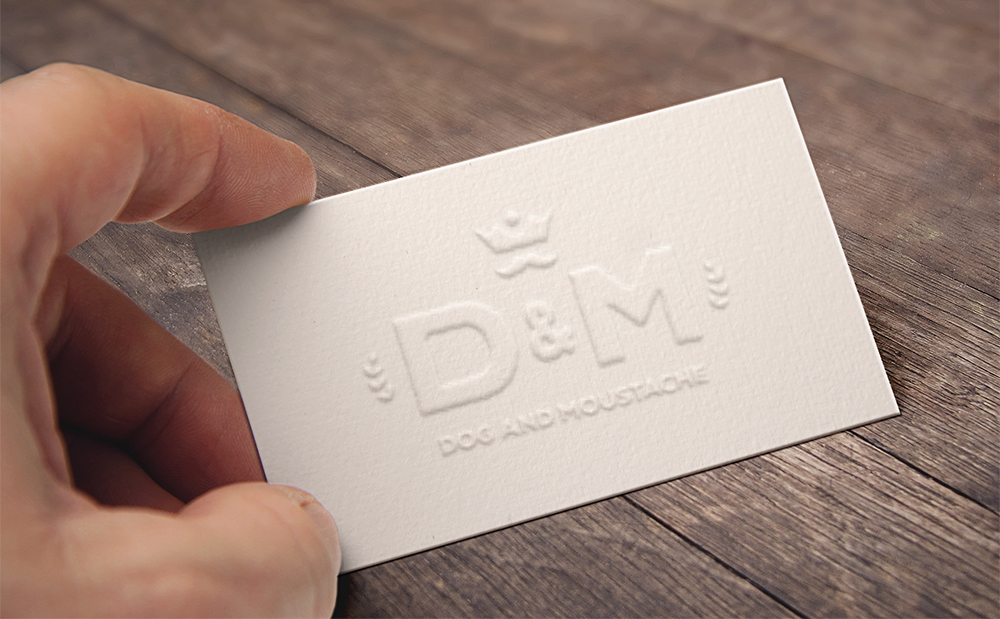
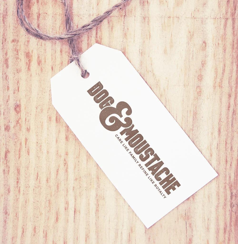
Client: Dog & Moustache
Project: Visual Identity
Year: 2015
A logo concept for a natural/chemical free car wash business in Austin, Texas. They wanted it to have a retro feel that would still signify high-quality care.
Client loved the concepts and was able to brand their website, t-shirts, hats, and much more to promote their business around town!