Introduce Capacity report
Role: Sr UX Designer • Company: Aha! • Teams: UX/PM/Engineering
The Goal
Introduce enhanced capacity planning to enable product managers to define, estimate, and schedule the work required to execute that roadmap. The capacity report will enable product teams to visualize that work, identify resource capacity issues or utilization problems, and reschedule or reassign work.
Design process
I followed the IDEO model for the human-centered design and Lean UX to apply iterative methods to create the capacity report. We also released this report internally to check for bugs and ensure it was successfully solving the problems we intended it to.
“This issue actually impedes us from moving from an Excel-based capacity planning for the operational roadmap to fully embrace Aha! as the single product management tool we should use.”
Research & Analyze
Talking directly with our customers is my favorite way to get a better understanding of their pain-points and needs. Additionally, hearing from users in their own words helps avoid guesswork and eliminate assumptions. Capacity planning is one of the most highly requested ideas which meant we had a lot of eager customers we could hear from.
User stories
Based on our research we decided the capacity report needed to solve for the following user stories:
As a product manager, I want to understand who on my team is overloaded so that I can adjust the schedule to ensure they are not overwhelmed and the most important work is being accomplished.
As a product manager, I want to understand a team's overall workload so that I can better manage and protect their schedule.
As a product manager, I want to see the remaining work so that I can better understand the health of a planned release/product launch.
As a product manager, I want to understand how work we've prioritized is assigned so that I can identify any potential scheduling conflicts.
“Right now we intervene through custom fields and excel spreadsheets to try to track across role types... it’s not pretty and hard to maintain.”
“We need a way to visualize who is overloaded and re-arrange tasks appropriately for a more effective resource and capacity management.”
Ideate & Design
Since many of our competitors have a capacity report in some variation I definitely wanted to start by looking at how they have done this. This would help us understand the industry standards and identify opportunities to innovate if possible.
Lo-fi WIREFRAMES
Sketching is a great way to get your thoughts out on paper without spending a lot of time working on the details. This was important for this report as we had so many moving parts and wanted to make sure all the details where included. Once we had some lo-fit sketches we could meet with the development team and make sure everything we wanted to achieve was possible.
Hi-fi mocks and prototype
When I felt we were in a good place with the wireframes I transferred over to Figma and started creating hi-fi mocks of our new capacity report. Here we could explore hover states and different ways to get useful information easily accessible to customers using the report.
Validate & Iterate
Usually I would create a prototype for usability testing but since this feature was so complex and needed to be able to handle many different use cases, we decided to develop a lo-fi prototype to test with. It was extremely important to flush out any issues before we spent a lot of effort developing the report, so quickly testing a rough version would allow us to discover any shortcomings or improvements we needed to make.
User Testing
We tested the prototype on 4 people and found they:
Wanted to see the completed work on the timeline
Needed more feedback in the UI letting the user know when they completed a task
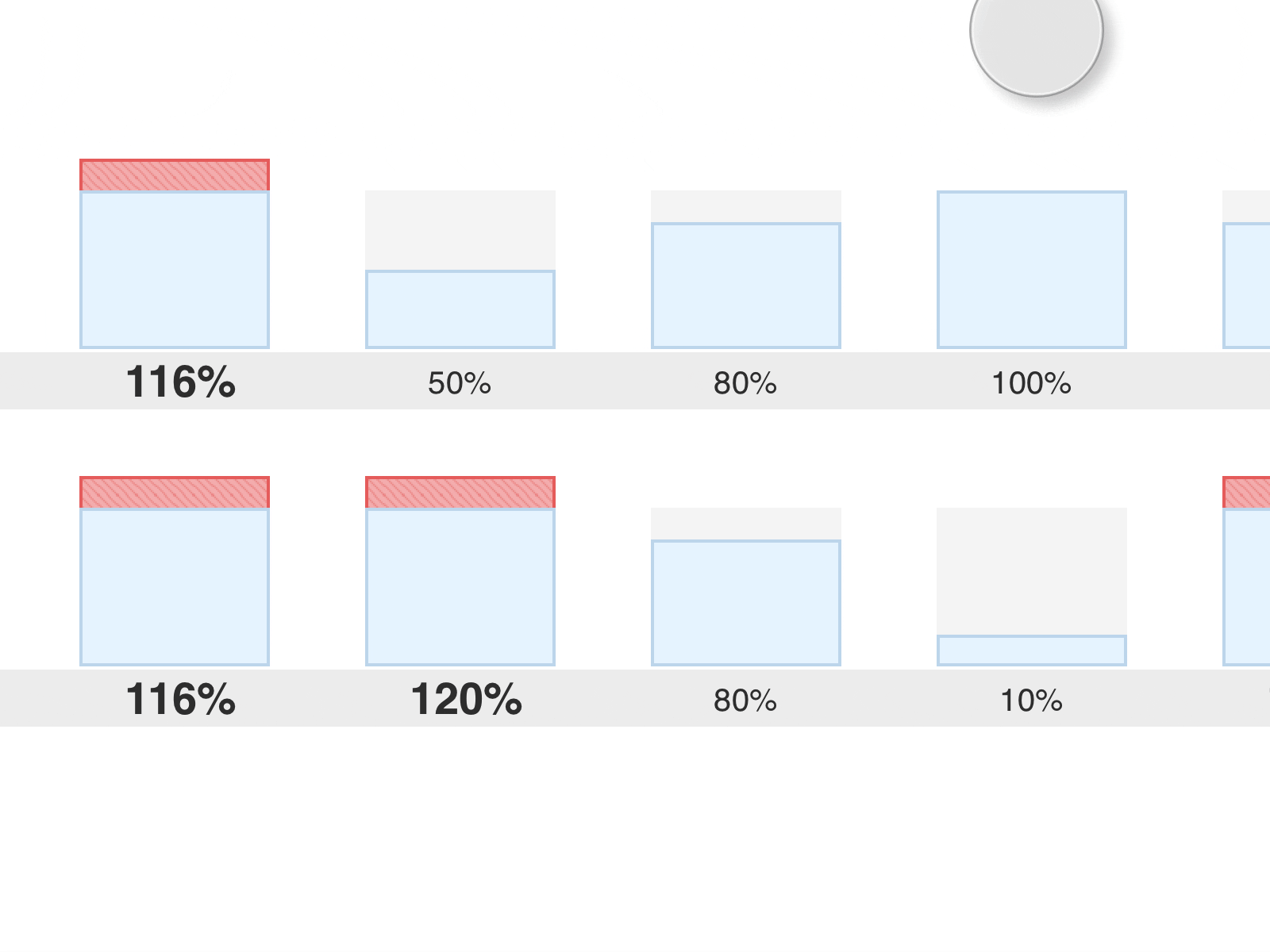
Needed to be clearer around how capacity numbers are being calculated
Needed clearer delineation for weekends on the timeline
Expected to be able to drag and drop features to re-assign work
Needed a better legend of the colors in the report
Design Iterations
As clear as I thought my initial designs were, it turns out that people were still struggling with around understanding what different parts of the UI meant. Once I completed and reviewed the design updates with those users we learned we had solved for the initial problem’s we ran into during testing.
Beta release
We identified a few customers that were interested in being part of our beta program - once the report was functional with all the improvements from our testing session we were able to release it to their accounts behind a feature flag so we could gather feedback from a small group of real customers.
We quickly realized we needed the report to be able to calculate capacity not just on individuals but also for teams and worked to get this implemented. For this we needed to update the settings to allow accounts to configure the teams, then allow the report to toggle between a people and team view.
Development
Since we already had a basic working report on a staging account the handoff was more fluid than most projects. Most of the underlying functionality had already been built so what was left was more around the clean up of the UI and interaction improvements. Before our kick-off meeting with engineering I worked with my Product Manager to breakdown the requirements and add any edge case designs (error states, empty states, hovers, animation).
Engineering handoff
We always start every project with a kickoff meeting with Engineering, myself, and the Product Manager to make sure everyone is on the same page and there are no blockers. Since we are a remote team we will usually set up a slack channel between all teams to make sure everyone is readily available if there are any questions.
QA review
Once engineering with the development on stage I was able to start the QA process. I like to mock up any design updates needed verses typing it out as this can be much easier to understand. I added requirements to the feature outlining where the execution didn’t align with the initial design.
Retrospective
This was one of the most complex features I have worked on at Aha! - it required a huge amount of cross-functional effort at every step of the way. Being able to run quick usability tests on a ‘skeleton report’ allowed us to constantly test the report at any stage of the process.
What went well
Great communication across teams allowed us to be able to make updates quickly when new requirements came in later in the project (e.g. allowing users to embed the report, not just share the report with a URL).
Lessons learned
Having beta release was extremely helpful - we were able to validate if our assumptions where correct and see where we might have been missing some functionally that would make this truly beneficial for our users.
Enhancing the user experience for this report was just as important as the underlying capacity calculations. Simple changes (like changing the direction of tool tips) where able to make large improvements to the overall UX.